How the logo-manual to WOC 2021 was founded?
Forest. Heartbeat. Distant yelling. 100% focus. Seeking optimal routechoice. The final step of years of preparation is approaching. Getting closer and closer to inevitable. The forest is opening. Spectators around the finish corridor are shouting, the whole arena is staring at the last meters to finish. Time is slowing down, world is now in slow motion, the end is close. Every second counts. Last remaining strength. Boom…
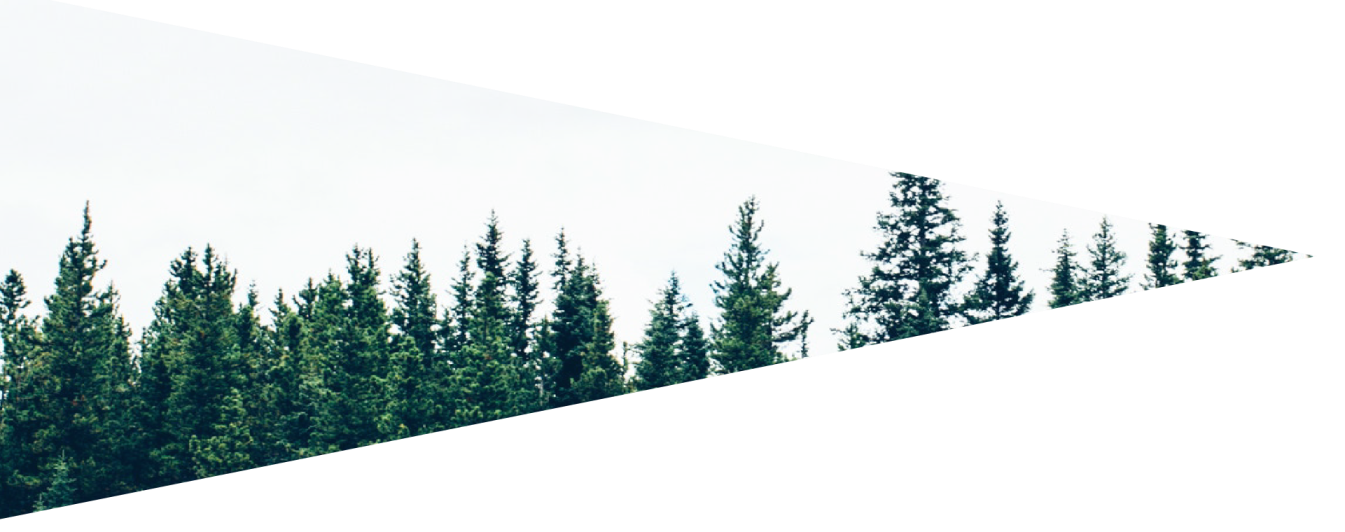
Imagination of emotional strain, nervousness or ecstatic happiness of success, that everything popped up in my head as potential inspiration for brand WOC 2021. The crucial moment happens to be the fact, that it is going to be forest championships, relatively young concept, when all the sprint and city disciplines are excluded and whole sport is returning to its roots. Literally. To the deeps of forests, breathtaking lengths and elevation, which doesn’t seem to be true. The luck factor is nearly 0 and priority gets stamina with self-assertiveness. Everything seems to go towards making this championship to set new ecological standard for organising orienteering competitions. Return to roots connected to newest technologies, helping in every organising sector, but also on every step of competitors. Whatever you see in logo – heartbeat, GPS tracking or forests horizon, everything is connected in one line, which appears in far until it gets into its finish: custom typography for WOC.
Petr Hostaš